Intrea
Branding for a bespoke diamond jewellery design company
Branding for a bespoke diamond jewellery design company
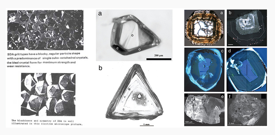
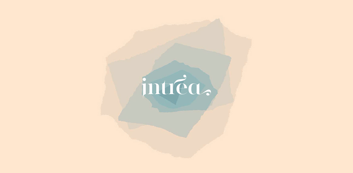
Intrea is designer Purva Kothatri's brand specializing in bespoke diamond jewellery. Every diamond is unique. There is an intricate process that goes into polishing a rough crystal to become a precious gem.
The brand language is a derivation of the cross section of a rough crystal that goes from being a ragged unpolished figure to a unique shape. The rough crystals inspired a visual iteration based on layers and transformation.
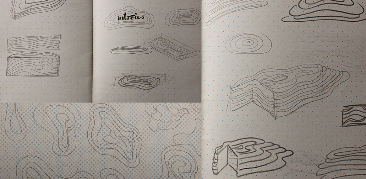
These forms were made by scanned layers of translucent vellum paper. The layers were isolated into individual shapes, colored and re-assembled in illustrator.
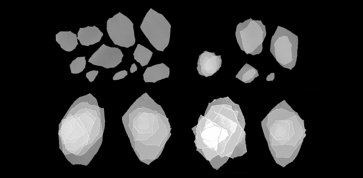
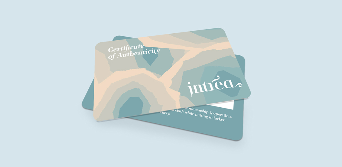
A series of five such crystal-inspired forms were designed to coalesce into Intrea's visual story. The pastel shades and translucency in the forms are in conjunction with the delicate intricacy that goes into designing and making every unique piece of Intrea jewelry.

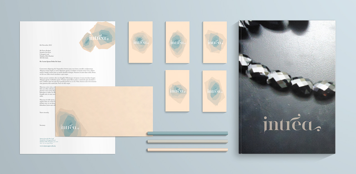
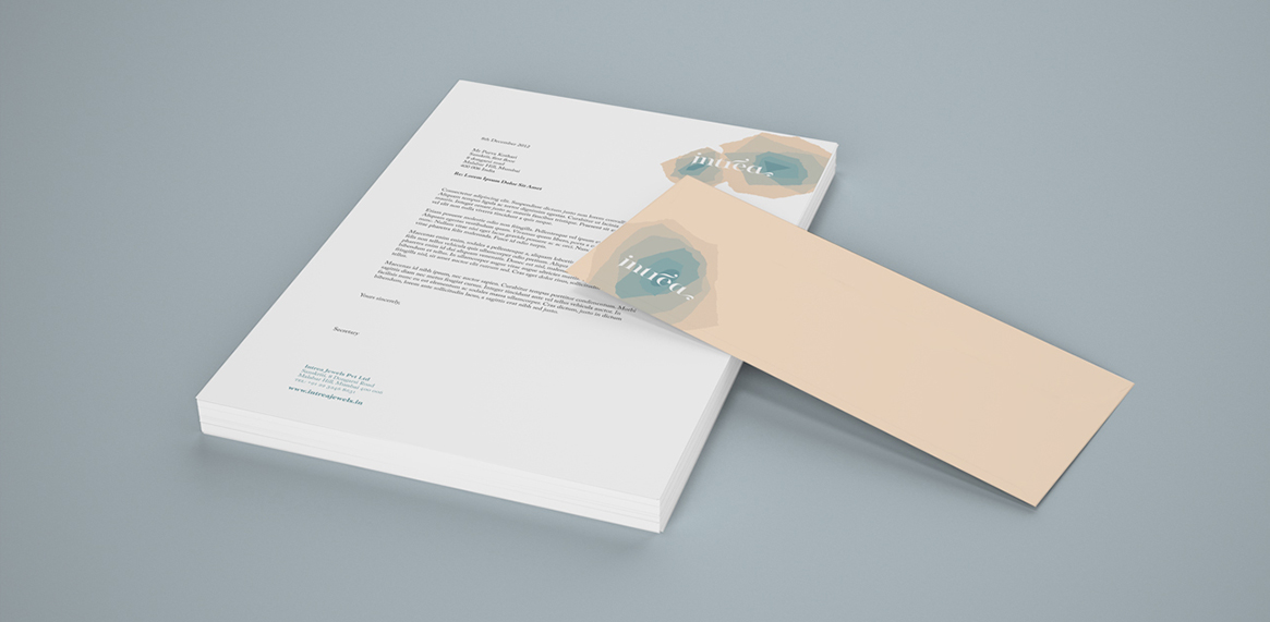
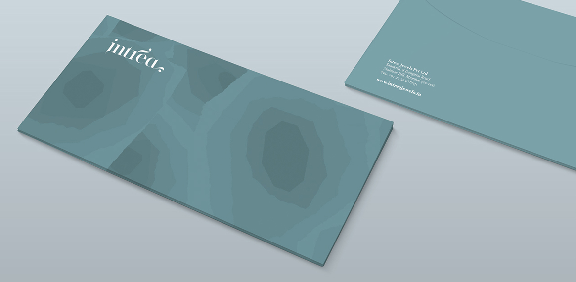
Intrea's corporate stationery set has more peach in its color story while the retail branding lies more in the dark teal bracket to differentiate it from the corporate language.
Project: with Addikt, Mumbai
Role: Concept, Branding, Graphic Design
Tools: Adobe creative suite
Logo design by Hooiwan Ling